
You’ve been told a thousand times that “correlation isn’t causation.” But nobody told you what to do next. Until now. https://www.linkedin.com/in/shorya-bisht-a20144349/
There’s a moment every analyst secretly dreads. You’ve built a gorgeous dashboard. The charts are clean, the numbers are compelling, and your stakeholder leans across the table and asks the one question that makes your stomach drop:
“So if we increase X, will Y go up?”
You pause. You smile. You say something careful like “the data shows a strong relationship between the two.” And then you go home and stare at the ceiling.
Because deep down, you know the truth: correlation told you they move together. It didn’t tell you why, or what happens if you actually pull that lever.
Welcome to the gap between data analysis and causal inference — the most important frontier in modern analytics that most analysts never formally cross. This post is your bridge.
Part 1: What Even Is Causation? (The Umbrella Problem)
Let’s start with an analogy so simple it might feel insulting — but stick with it, because it’s the foundation of everything.
Imagine you live in a city and you notice something interesting: on days when more people carry umbrellas, more people also slip and fall on the street. You run the numbers. The correlation is real. Strong, even.
Does this mean umbrellas cause people to fall?
Of course not. A third factor — rain — causes both umbrella-carrying and slippery streets. The umbrellas and the falls are correlated, but neither causes the other.
This is called a confounding variable (or confounder), and it is the #1 enemy of every analyst trying to answer “why” questions with observational data.
Now replace “umbrellas” with “ad spend” and “falls” with “sales,” and you suddenly have a $10 billion business problem.
“The goal of causal inference is to answer questions that randomized experiments would answer, but using observational data where experiments weren’t run.” — Judea Pearl, Turing Award winner and author of The Book of Why
Part 2: The Ladder of Causation
Judea Pearl — widely considered the godfather of modern causal inference — proposed what he calls the Ladder of Causation. Think of it as three floors of a building, each taller and more powerful than the last.
🪜 Floor 1: Association (“Seeing”) “What is?”
This is classic statistics. You observe. You correlate. You describe. Ice cream sales and drowning rates are correlated. You’re watching the world, not touching it. Most business dashboards live here.
🪜 Floor 2: Intervention (“Doing”) “What if I do X?”
This is where experiments live — A/B tests, randomized trials, policy changes. What happens to drowning rates if I ban ice cream? You’re now manipulating the world. This is the level most analysts want to be on but rarely have the luxury of testing.
🪜 Floor 3: Counterfactuals (“Imagining”) “What would have happened if…?”
If I had bought Apple stock in 2010, how rich would I be today? This is the most powerful level — and the hardest. It requires a mental model of the world, not just data from it.
Here’s the uncomfortable truth: most business decisions require Floor 2 or Floor 3 thinking, but most analytics only deliver Floor 1 answers. Causal inference is the toolkit that gets you upstairs.
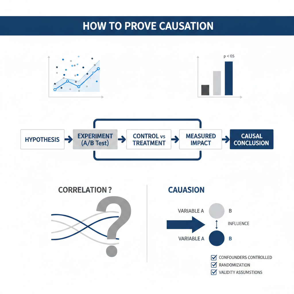
Part 3: Why Randomized Experiments Are the Gold Standard (And Why You Can’t Always Run One)
The cleanest way to establish causation is a Randomized Controlled Trial (RCT) — randomly assign people to treatment and control groups, change one variable, measure the difference. Pharmaceutical companies do this. Tech companies run A/B tests. It works beautifully.
But here’s real life:
- You can’t randomly assign people to smoke cigarettes for 20 years to study lung cancer.
- You can’t randomly assign countries to different tax policies.
- You can’t go back in time and run the test before your company made the decision.
- Your product team already launched the feature to everyone — no control group.
This is where observational causal inference becomes essential. It’s the art of drawing causal conclusions from data where randomization didn’t happen. And it’s far more scientific — and far more achievable — than most analysts realize.
“The most important questions in life are causal, not statistical. ‘Does this drug work?’ is a causal question, not a correlational one.” — Donald Rubin, Harvard statistician and co-developer of the Rubin Causal Model
Part 4: The Core Toolkit — Practical Methods That Actually Work
Let’s get practical. Here are the key methods you can actually apply. Think of each as a different “workaround” for when you can’t run a perfect experiment.
🔧 Method 1: Difference-in-Differences (DiD)
The analogy: Two identical twins. One starts going to the gym in January. The other doesn’t. By March, Twin A has lost 10 lbs. Twin B has lost 2 lbs (maybe just from seasonal changes). The difference in the difference — 8 lbs — is your estimate of what the gym caused.
In practice: You compare a group that received a treatment (a new policy, a product feature, a price change) to a similar group that didn’t, before and after the change. The key assumption is the parallel trends assumption — that both groups would have trended similarly if the treatment hadn’t happened.
When to use it: When you have a policy change, product launch, or any treatment that happened at a specific time to one group but not another.
🔧 Method 2: Regression Discontinuity Design (RDD)
The analogy: Imagine a scholarship is awarded to everyone who scores above 70 on an exam. Students scoring 69 and students scoring 71 are basically identical in ability — they just barely fell on different sides of a line. Any difference in their future outcomes is likely caused by the scholarship, not by their abilities.
In practice: You exploit an arbitrary cutoff or threshold in the data. People just above and just below the cutoff are, on average, very similar — making it a near-experiment.
When to use it: Credit score thresholds, age cutoffs, test score benchmarks, policy eligibility rules.
🔧 Method 3: Instrumental Variables (IV)
The analogy: You want to know if education causes higher income, but smarter people both get more education and earn more — a confound. Solution: find something that affects education but has no direct effect on income. Distance to the nearest college is the classic example. Kids who grew up far from a college got less education — not because they were less capable, but because of geography. That instrument lets you isolate the causal effect.
In practice: You need a variable (the “instrument”) that:
- Strongly predicts the treatment (education)
- Only affects the outcome (income) through the treatment — not directly
When to use it: Pricing analysis (using cost shocks as instruments), marketing attribution, healthcare economics.
🔧 Method 4: Propensity Score Matching (PSM)
The analogy: You want to know if a job training program helped unemployed people find work. But people who chose the program might be more motivated than those who didn’t — another confound. Propensity score matching finds, for each person who attended the program, a statistical “twin” who had the same characteristics but didn’t attend. Then you compare twins.
In practice: You model the probability of being treated (the propensity score) based on observed characteristics, then match treated and untreated units with similar scores.
When to use it: Observational studies where you can’t randomly assign, customer analysis, healthcare outcomes.
🔧 Method 5: Causal Graphs (DAGs)
The analogy: Before you run any analysis, draw a map of how you think the world works. Who causes what? Which variables are confounders? Which are mediators (on the causal path)? This map — called a Directed Acyclic Graph (DAG) — is your blueprint.
In practice: A DAG is a diagram of nodes (variables) and arrows (causal relationships). It tells you which variables to control for — and critically, which ones not to control for. Controlling for the wrong variables can actually introduce bias.
“A model is a lie that helps you see the truth.” — Paraphrased from George Box’s famous aphorism: “All models are wrong, but some are useful.”
Part 5: The Biggest Mistakes Analysts Make (And How to Avoid Them)
Understanding the toolkit is half the battle. The other half is avoiding the traps.
Mistake #1: Controlling for everything “just in case” More controls = more accuracy, right? Wrong. Controlling for a mediator (a variable that lies on the causal path) blocks the very effect you’re trying to measure. Controlling for a collider opens up spurious associations. Drawing a DAG first prevents this.
Mistake #2: Ignoring the counterfactual Every causal claim is implicitly a counterfactual claim. “The campaign increased sales” means “sales would have been lower without the campaign.” Always ask: what is my counterfactual, and how am I estimating it?
Mistake #3: Assuming your parallel trends hold Difference-in-Differences lives and dies by the parallel trends assumption. Always plot pre-treatment trends for both groups. If they weren’t trending similarly before, your DiD estimate is suspect.
Mistake #4: Weak instruments In instrumental variables, a weak instrument (one that barely predicts treatment) can give you estimates that are more biased than ordinary regression. Always check instrument strength with an F-statistic (rule of thumb: F > 10).
Mistake #5: Confusing statistical significance with causal significance A p-value tells you if an effect is unlikely to be zero. It says nothing about whether the relationship is causal. This distinction has cost businesses — and science — enormously.
Part 6: A Real-World Walkthrough — Did Our App Feature Actually Work?
Let’s make this concrete. Say your company launched a new onboarding feature in March. You look at data and see: users who used the new feature retained at 70%; users who didn’t retained at 45%. Your PM is thrilled.
But wait. Who used the new feature? Probably the most engaged, tech-savvy, motivated users. Of course they retained better — they were going to retain anyway. This is classic selection bias.
Here’s how you’d approach it causally:
- Draw your DAG. Feature usage → Retention. But Engagement level → Feature usage AND Retention. Engagement is a confounder.
- Try DiD. Did you roll out the feature to some user cohorts before others? If so, compare the retention trends of early-access vs. later cohorts before and after rollout.
- Try propensity score matching. Match feature users to non-users with similar engagement scores, device types, and signup dates. Compare retention within matched pairs.
- Look for natural instruments. Was there a bug that prevented some highly engaged users from seeing the feature? That’s your instrument.
None of these methods is perfect. But each gets you closer to the truth than “users who used it retained better.”
Part 7: Tools to Get You Started
You don’t need a PhD to start applying causal inference. Here are practical starting points:
- Python: The
DoWhylibrary by Microsoft is one of the most accessible causal inference frameworks. It forces you to declare your causal assumptions explicitly, which is itself a valuable discipline. - R: The
dagittypackage for drawing and analyzing DAGs;MatchItfor propensity score matching;rdrobustfor regression discontinuity. - No-code exploration:
DAGitty.netlets you draw causal graphs in a browser and will tell you which variables to control for — for free. - Reading: The Book of Why by Judea Pearl (accessible), Mostly Harmless Econometrics by Angrist & Pischke (rigorous), Causal Inference: The Mixtape by Scott Cunningham (free online, excellent).
“Causal inference is not a set of tricks. It’s a way of thinking about the world.” — Scott Cunningham, economist and author of Causal Inference: The Mixtape
Part 8: When to Call It — Knowing Your Limits
Here’s something important nobody says enough: causal inference from observational data always requires assumptions. You can never fully “prove” causation without an experiment. What you can do is:
- Make your assumptions explicit (instead of hiding them inside a correlation)
- Test those assumptions where possible
- Report your estimates with appropriate uncertainty
- Be honest with stakeholders about what the analysis can and cannot say
The goal isn’t to pretend you ran an experiment. The goal is to think like an experimentalist even when you couldn’t run one.
That intellectual honesty — combined with the right methods — is what separates good analysts from great ones.
Conclusion: The Most Valuable Upgrade You Can Make
Here’s what I want you to take away from all of this.
Every time someone asks “should we do more of X?”, they are asking a causal question. Every pricing decision, every marketing campaign, every product launch — causality is the hidden operating system underneath all of it.
For years, analytics has been extraordinarily good at describing the past. What happened. When it happened. How much. That’s valuable. But the questions that actually move businesses forward are different. What will happen? What caused this? What would have happened if we’d done something different?
Those questions live in causal territory.
The good news: you don’t have to become an econometrician overnight. Start with DAGs. Start asking “what’s the confound here?” every time you see a correlation. Start questioning whether that control variable should actually be in your model.
The shift from correlation to causation isn’t just a methodological upgrade. It’s a change in how you see data — from a mirror reflecting the past, to a window onto what’s actually true.
And once you see that way, you can’t go back.
If this post sparked something for you, the best next step is Scott Cunningham’s free book Causal Inference: The Mixtape at mixtape.scunning.com — it’s the most accessible technical deep-dive available, and it’s completely free.
Authored by: Shorya Bisht